
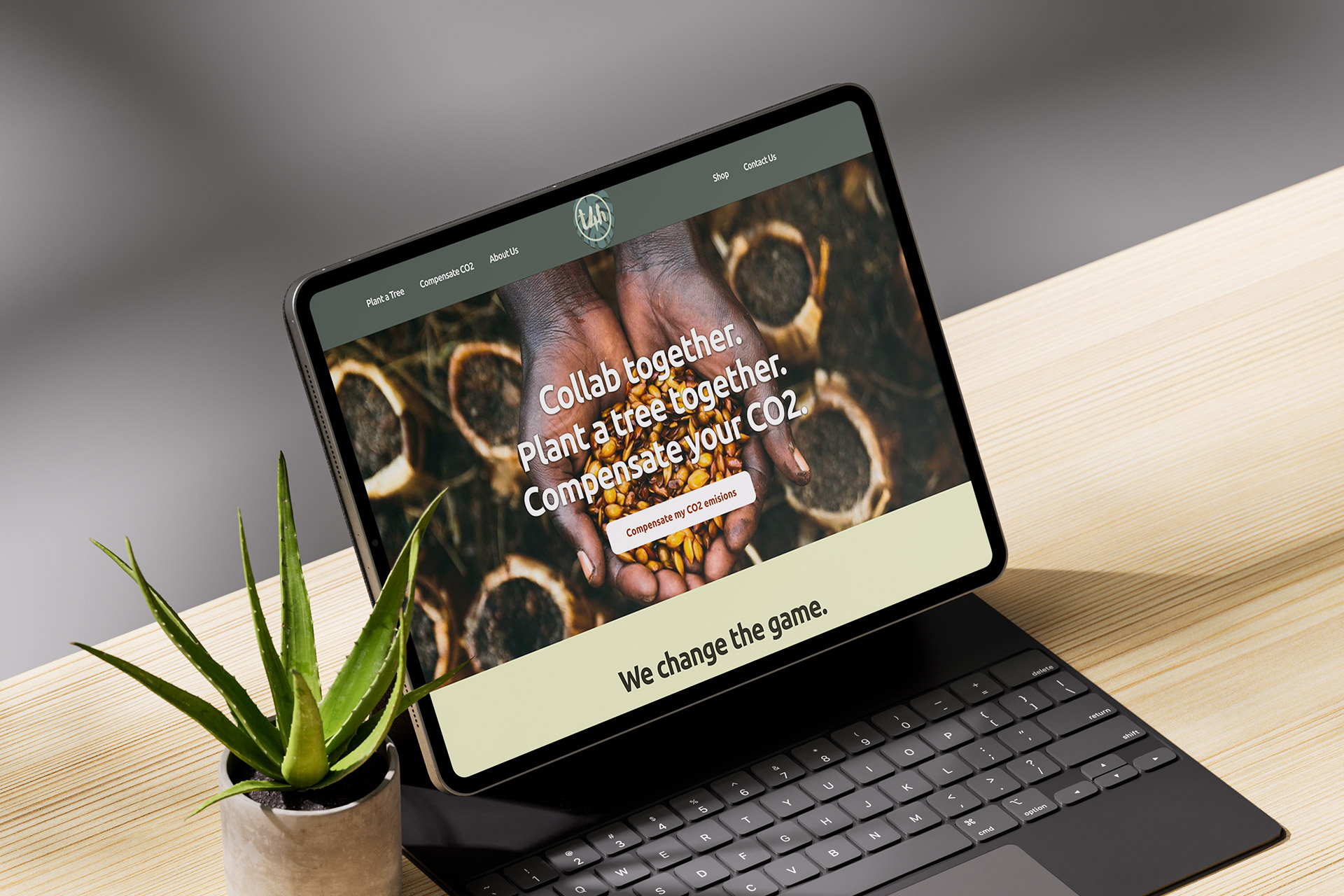
Photo: Trees4Humanity home page.
Project: Trees4Humanity website
I helped design and build Trees4Humanity (T4H), a non-profit initiative that enables companies to compensate their CO₂ emissions through reforestation partnerships.
My role covered the full scope, from defining the brand identity and user experience to developing the final WordPress website. The challenge was to design an NGO platform that felt corporate, credible, and purpose-driven, without losing its emotional connection to nature.
- Role: Full Stack Designer (UX/UI, Branding, WordPress Development)
- Client: Independent entrepreneur
- Project type: Freelance project
- Platform: WordPress
The problem
The opportunity

Image 1: Trees4Humanity pot animation.
The process
A solo engagement, leading the full process, from concept to implementation.
I benchmarked several international reforestation and carbon-offset organizations, focusing on their tone, trust mechanisms, and data visualization styles.
Budget and time constraints meant there was no formal UX research phase; instead, insights came from competitive analysis and on-the-fly validation during iteration.
2. Define & Ideation
With only the isotype provided, I defined a micro-brand identity system to support the website’s storytelling. The challenge was to find the right balance between corporate credibility and environmental empathy.
I built a color palette that merged natural greens with muted earth tones, evoking growth and stability, while the supporting illustrations and textures conveyed transparency and renewal.
The narrative was built around the biodegradable pot innovation: a tangible proof point that grounded T4H’s purpose. I framed the experience around this differentiator, making it the visual and emotional centerpiece. The website content architecture guided users from what the problem is → how T4H solves it → how to participate.
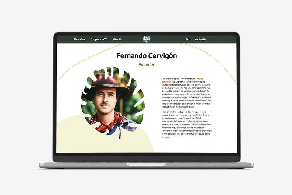
Image 2: Trees4Humanity about us page, section "Founder"
3. Design
I designed every visual element from scratch — layout, iconography, imagery, and graphic components. The visual rhythm emphasized calmness and authority through generous white space, structured typography, and modular sections.
A unique request from the client was to include animated illustrations showing how the biodegradable pots worked. I executed this through SVG and CSS animations, designed to be lightweight and educational. These subtle animations provided both engagement and clarity, explaining complex processes in a visual and intuitive way.
Deliverables
- Micro-brand identity
- Brand support illustrations
- Home page + 4 internal pages
- Contact form
4. Delivery
The site was developed using a customized WordPress theme, optimized for responsiveness and easy content management. I implemented flexible page structures to allow the client to expand storytelling as the NGO grew.
The system was configured for scalability and client autonomy for later updates.
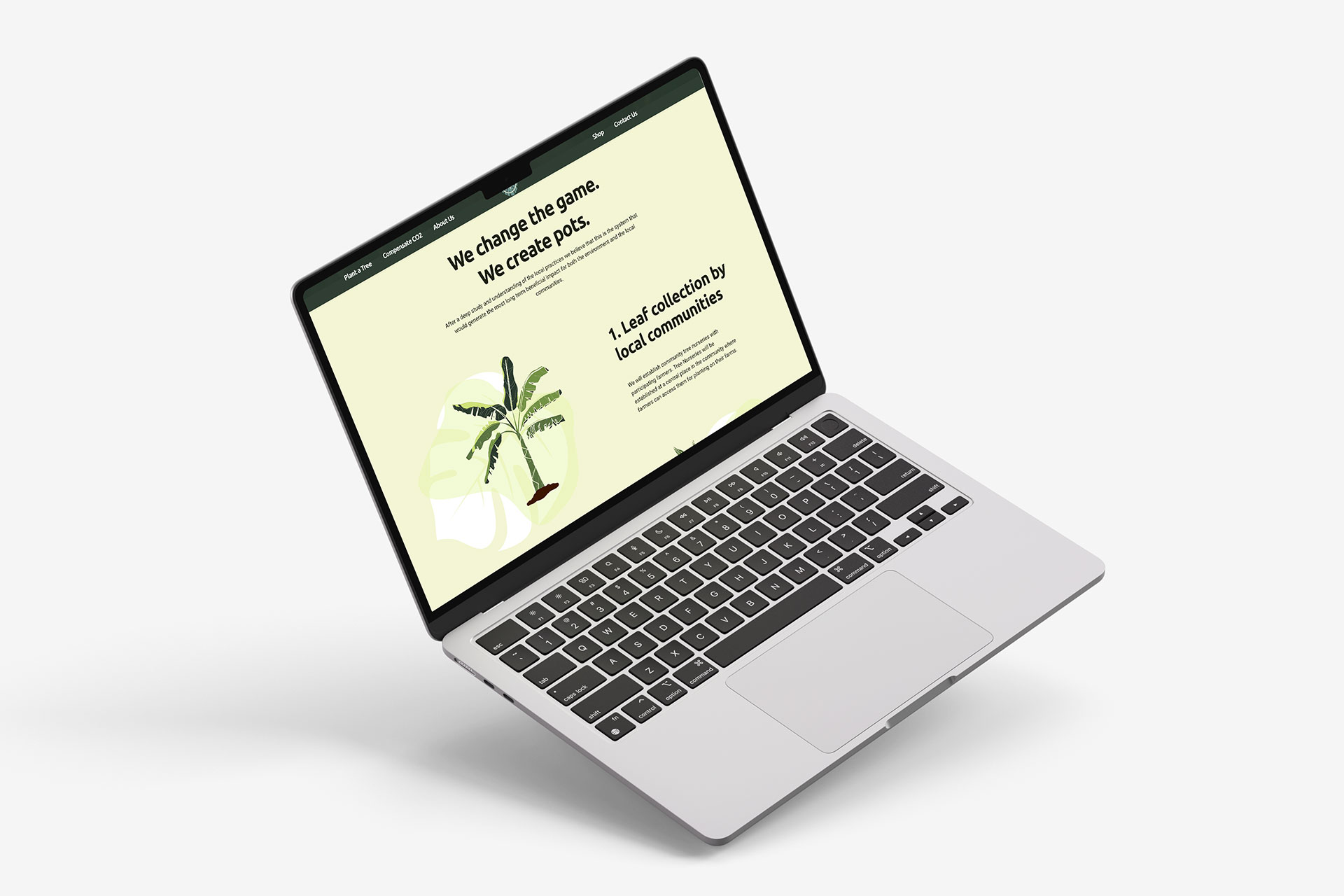
Image 3: Trees4Humanity home page, section "How it works".
The outcome
Product delivered!
Although I wasn’t involved in the post-launch performance cycle, the site successfully achieved its main goal, delivering a credible and differentiating presence for an emerging environmental NGO.
The result was a cohesive digital identity that positioned Trees4Humanity as a serious, innovation-led sustainability partner for companies seeking CO₂ offset solutions.
Want to discuss my approach? Let’s connect.
Book a 1:1 with me. Book a slot that works for you.
Madrid, Spain
UTC +01:00
Monday to Friday
10:00 am - 1:00 pm
2:00 pm - 4:00 pm
7:00 pm - 8:30 pm