
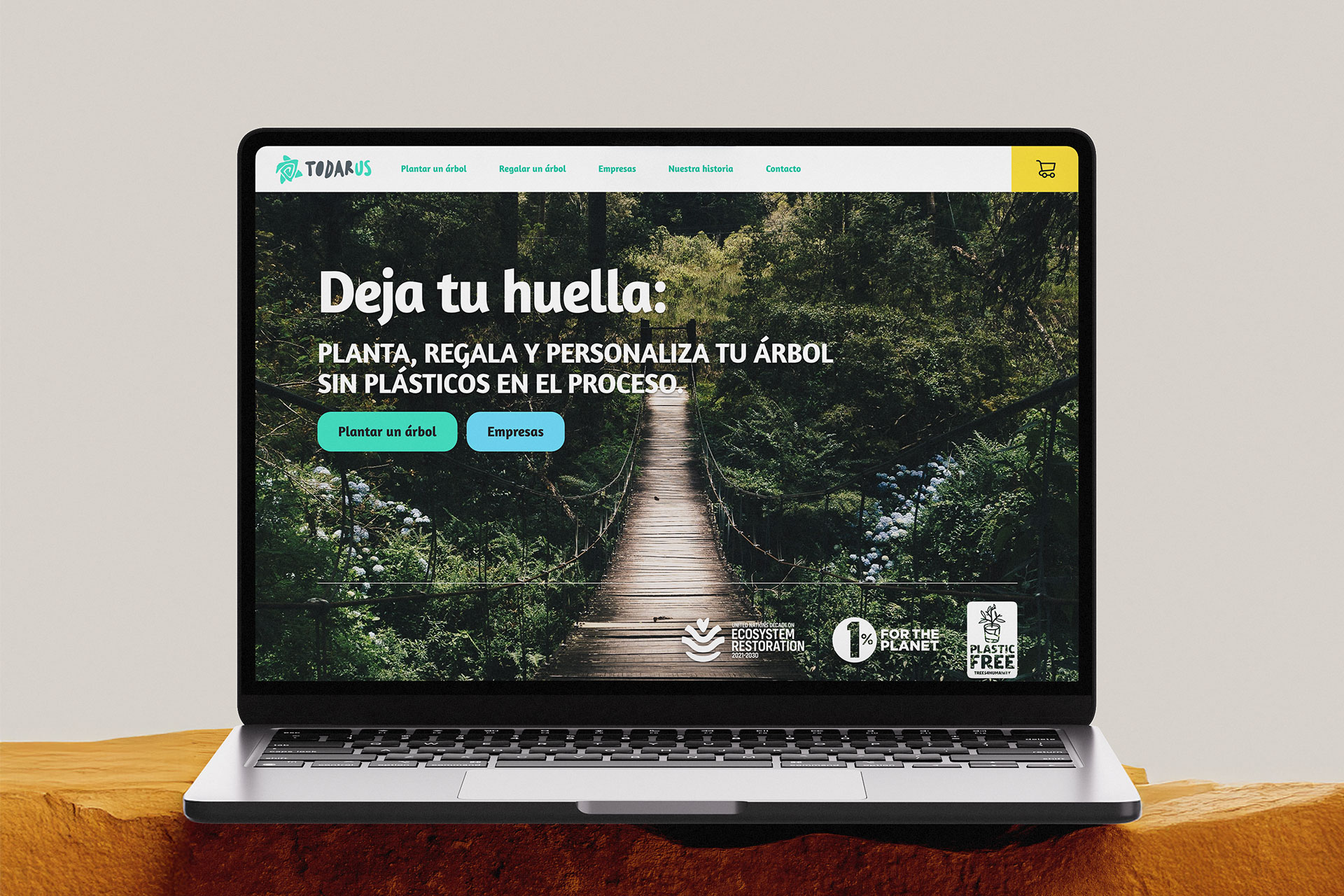
Photo: Todarus home page.
Project: Todarus eCommerce (product pivot)
I helped build Todarus, an eCommerce platform designed to make reforestation easy, transparent, and engaging.
The goal was to motivate users to fund the planting of trees, while transforming a traditionally non-profit experience into a simple, trustworthy digital product.
- Role: Full Stack Designer (UX/UI, Branding, WordPress Development)
- Client: Independent entrepreneur
- Project type: Freelance project
- Platform: WordPress + Woo Commerce
The problem
The opportunity
The project’s main challenge was creating trust around an intangible product. Unlike buying physical goods, users were asked to believe in an environmental contribution — something abstract and easy to doubt.
Additionally, the client wanted to avoid the typical NGO aesthetic. Instead of guilt-driven messaging or somber tones, the goal was to craft a brand that felt positive, reliable, and modern, inspiring users to participate through design clarity and emotional storytelling.
The process
A solo engagement, leading the full process, from concept to implementation.
1. Research
I analyzed similar initiatives such as Treedom, EcoTree, and Plant a Tree Project to understand their tone, structure, and UX approaches.
Given the project’s limited budget, formal user research wasn’t possible, so the exploration relied heavily on competitive benchmarking and heuristic evaluation.
2. Define & Ideation
Although the product direction was already established —a WooCommerce store— I treated this limitation as a design challenge: how can an eCommerce platform evoke purpose rather than just facilitate transactions?
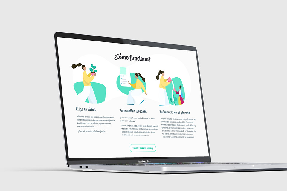
I began by outlining the emotional narrative of the brand. Instead of pushing the idea of “social cause” I reframed the action as participating and gifting ownership, users weren’t just buying trees, they were actively planting life while gifting.
- Todarus Turquoise
- Todarus Malibu
- Todarus Charleston
- Todarus Dark electric blue
- Todarus Platinum
- Todarus Stain
- Todarus Gargoyle gas
- Todarus Razzmatazz

3. Design
Once the visual direction and emotional tone were defined, the design phase became about bringing coherence and credibility to every touchpoint. I approached it as both a branding exercise and an as a experience process, where every decision needed to support trust, engagement, and simplicity.
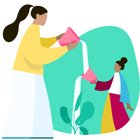
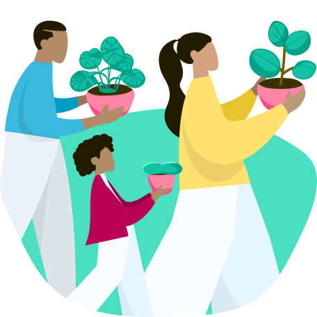
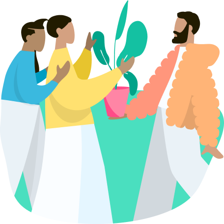
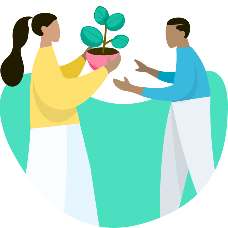
I designed the full visual identity, from logo to brand colors, illustrations, and interface components. Illustrations became the emotional backbone of the experience: approachable, organic, and human. This allowed the interface to communicate purpose and transparency even before the first click.
The balanced color palette avoid clichés often seen in sustainability projects, positioning Todarus as modern environmentalism rather than traditional charity.
In the user interface, clarity and trust guided every layout choice. I prioritized readability, hierarchy, and openness. The homepage immediately communicates purpose through a balance of imagery and storytelling.
Microinteractions were kept simple but intentional: soft hover states, smooth transitions, and breathing room between content blocks created a rhythm that feels calm and trustworthy. Accessibility was another consideration, like sufficient contrast ratios, clear CTAs, and a logical flows.
Finally, I assembled a small/compact design system within Figma before development, defining color tokens, typography scales, spacing grids, and components, to accelerated the WordPress build, but also to created a structure that the client could later expand without breaking consistency.


4. Delivery
I built the complete eCommerce website using WordPress and WooCommerce, ensuring scalability and client autonomy for later updates.
The system was configured for clarity and accessibility, emphasizing ease of donation and product browsing.
Deliverables
- Brand imagotype
- Brand identity
- Brand support illustrations
- Home page + 7 internal pages
- 34 products published
- Contact form
The outcome
Product delivered!
As the project was handed off after launch, I wasn’t part of the ongoing performance cycle. However, the final product successfully delivered:
- A cohesive and engaging eCommerce experience for reforestation initiatives.
- A distinct brand identity that positioned Todarus away from the typical NGO archetype.
- A fully functional WooCommerce implementation ready for user transactions.
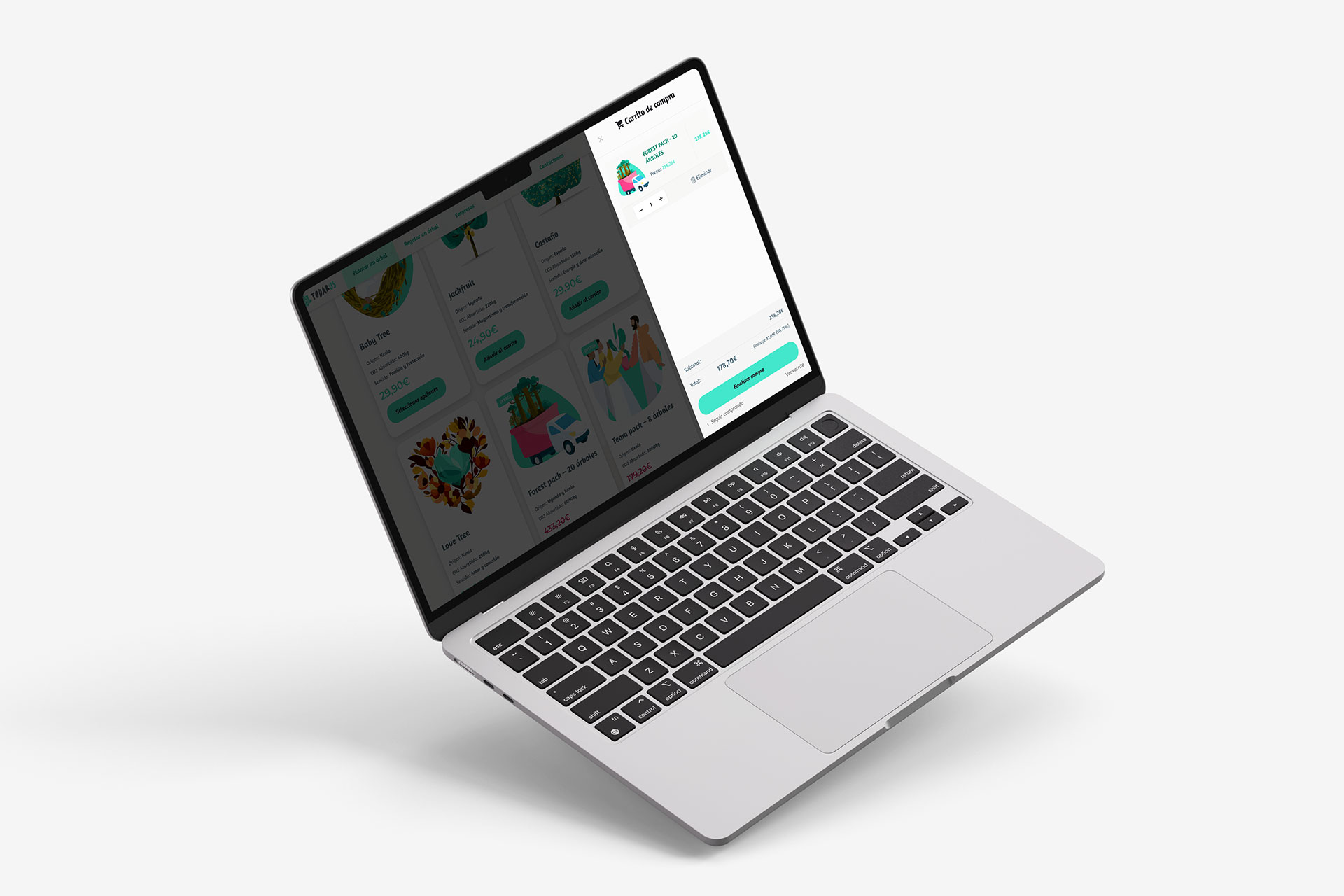
Image 3: Todarus shopping cart.
Want to discuss my approach? Let’s connect.
Book a 1:1 with me. Book a slot that works for you.
Madrid, Spain
UTC +01:00
Monday to Friday
10:00 am - 1:00 pm
2:00 pm - 4:00 pm
7:00 pm - 8:30 pm