
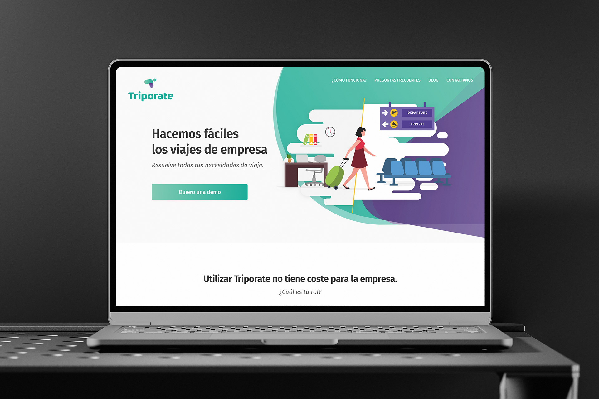
Photo: Triporate home page.
Project: Triporate SaaS MVP
Triporate is a SaaS platform that redefines business travel management through automation, compliance, and usability. Designed for companies of all sizes, it centralizes the process of booking, approving, and invoicing corporate trips, merging the simplicity of a consumer travel platform with the control and compliance of an enterprise-grade tool. My role covered the entire design lifecycle: user experience, interface, information architecture, and brand foundation.
- Role: UX/UI Designer
- Client: Startup in seed stage, while participating in an incubator program
- Project type: Freelance project
The problem
The opportunity
Triporate addressed a critical inefficiency: the manual, fragmented, and costly process of managing corporate travel. Most companies faced four pain points: wasted time, lack of expense control, slow approval flows, and complex billing.
The challenge was to create a solution that could:
- Centralize travel management (flights, hotels, trains, etc.) on a single digital platform
- Automate compliance with corporate travel policies before booking is confirmed
- Streamline approval workflows through intelligent routing
- Generate unified invoices and detailed reports for finance teams
From a design perspective, the complexity lay in balancing two seemingly opposite needs: Delivering a simple, intuitive UX for employees booking trips; Preserving strict control, visibility, and structure for administrators managing budgets and compliance.
The “wizard” model –a guided process for constructing trip requests– became a core UX feature. It not only simplified booking but also educated users to communicate with the AI-powered backend more effectively.
The process
Early design validation sessions prevented future bottlenecks and reinforced product confidence among founders and investors
1. Research
I explored competitor platforms and industry analogues, including traditional TMCs (Travel Management Companies) and emerging SaaS products. The research validated that while the corporate travel market was growing, UX maturity lagged behind, providing Triporate a chance to differentiate through simplicity and automation.
2. Define
The business and product structure were partially predefined, as Triporate already had a clear goal: become the digital backbone for corporate travel operations. My task was to articulate the brand story, UX flows, and platform tone to align with this vision.
3. Ideation
Using wireframes and flow diagrams, I co-created and iterated key user journeys with the founders.
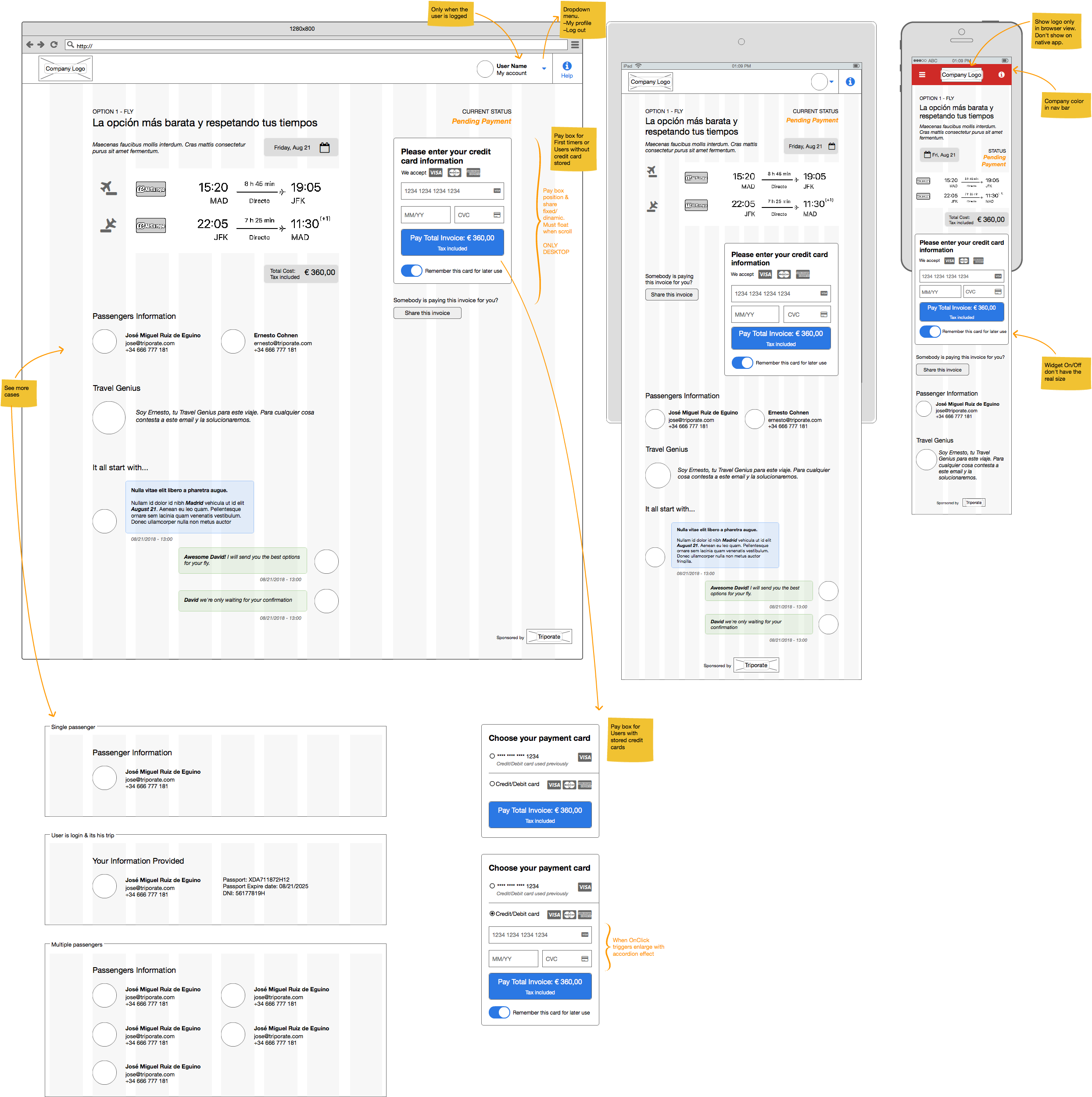
Image 3: Triporate SaaS, wireframe, trip payment flow.
Align early on strategy and scope.
Define the full flow.
Build stakeholder commitment to the design direction.
4. Design
The design approach ensured both visual appeal and structural clarity — essential for complex enterprise UX.
I built the design foundation from scratch, translating abstract concepts like “simplicity,” “trust,” and “efficiency” into tangible visual and experiential principles. This resulted in a complete yet minimal identity system that could flex from marketing to product UI seamlessly.
- Triporate Persian Green
- Triporate Spanish Violet
- Triporate Button Blue
- Triporate Limerick
- Triporate Amber
- Triporate Crimson
- Triporate Cultured
- White


Brand & Visual System
I developed a foundational brand and interface design system that reflected Triporate’s value proposition: automation without complexity.
Logotype: Open and fluid shape, it consists of an abstract shape that evokes the initial letter ‘T’ of the brand. A ‘T’ not rigid, with organic curves and a flow to suggests movement, travel, and adaptability. A contemporary, minimalist, and above all dynamic approach to position Triporate within the technology sector (SaaS).
Color Palette: The color palette is key to understanding the brand's emotional promise. A combination of turquoise green and purple tones was used to create a synergy with purpose. Purple seeks to establish that Tripórate's technology as sophisticated, while turquoise green promises that this sophistication will result in a simple and stress-free business trip.
Tipography: A humanist sans-serif, the chosen font is a modern sans-serif with clean lines but a subtle warmth (humanist), to balance the inherent coldness of software with the need for trust and user experience. Also chosen for legibility and tone consistency across both web and app interfaces.
Iconography: Minimalist, linear, and highly functional aesthetics, aligned with contemporary design trends for SaaS platforms. Stroke consistency was used to ensure optimal scalability and legibility even at small sizes. The Outline style icon set avoids cognitive overload from color or fill, allowing the SaaS platform to maintain its own visual identity and enable co-branding.
This foundation became the starter brand kit for the startup, used across the product interface, website, and early investor materials. It was designed to evolve, and scalable enough for future challenges without losing coherence or recognizability.
A consistent, scalable, and timeless visual language, avoiding passing trend, to ensure a long lifespan for the platform interface.
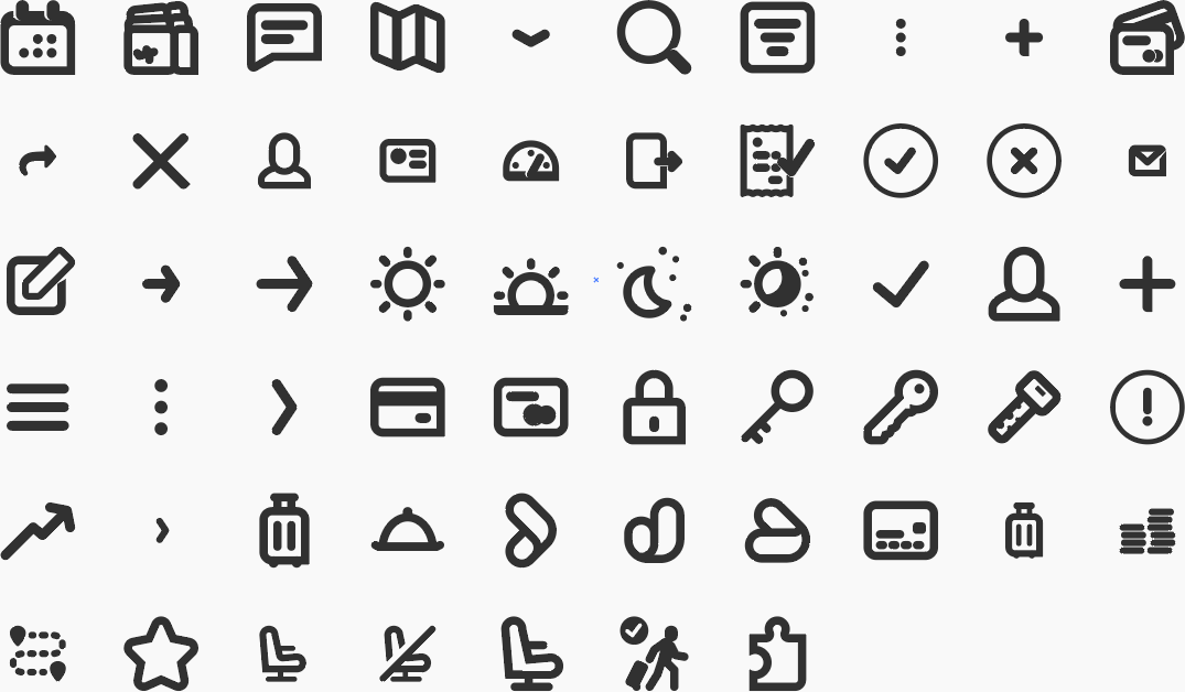
Image 4: Triporate iconography, custom designed icons.
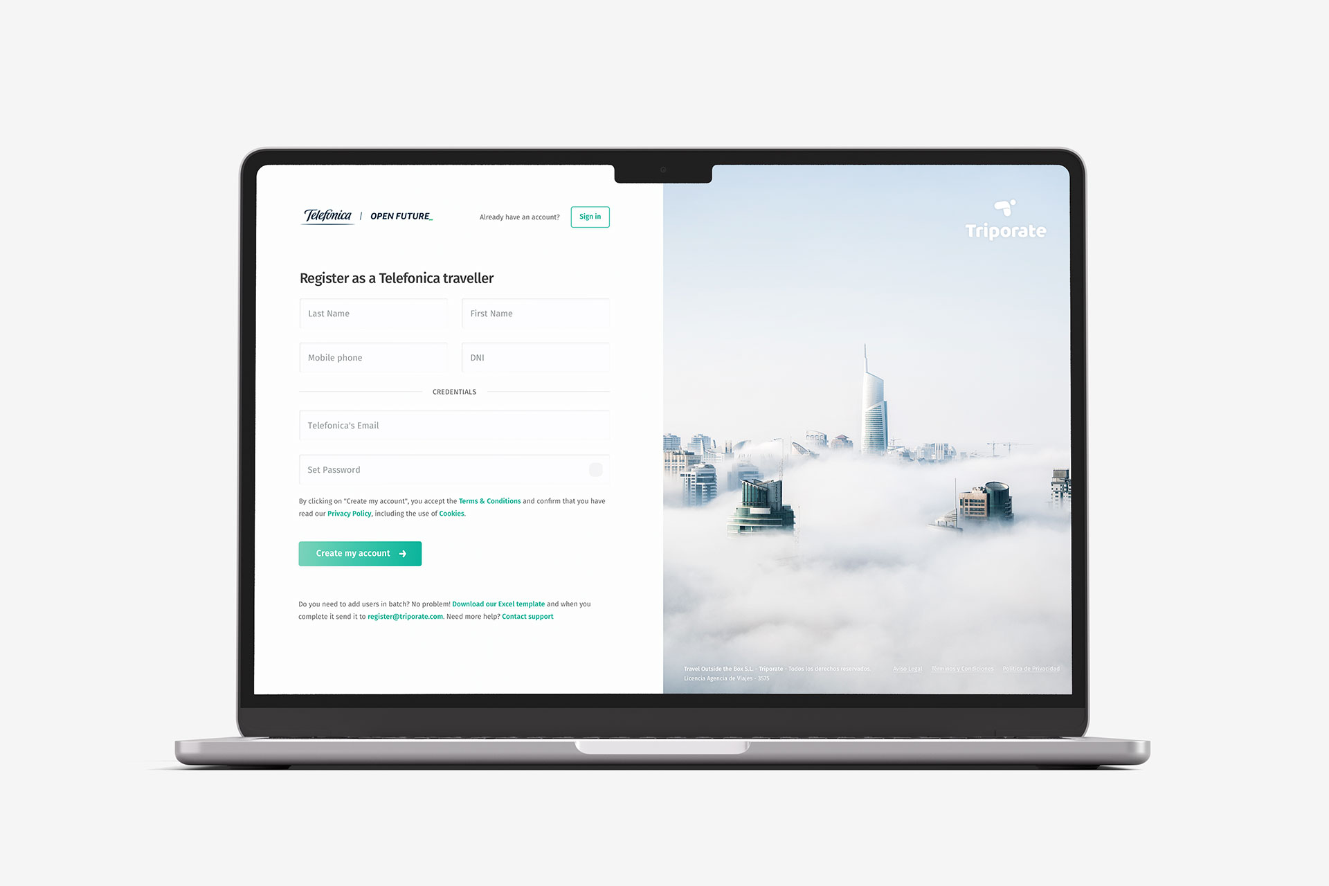
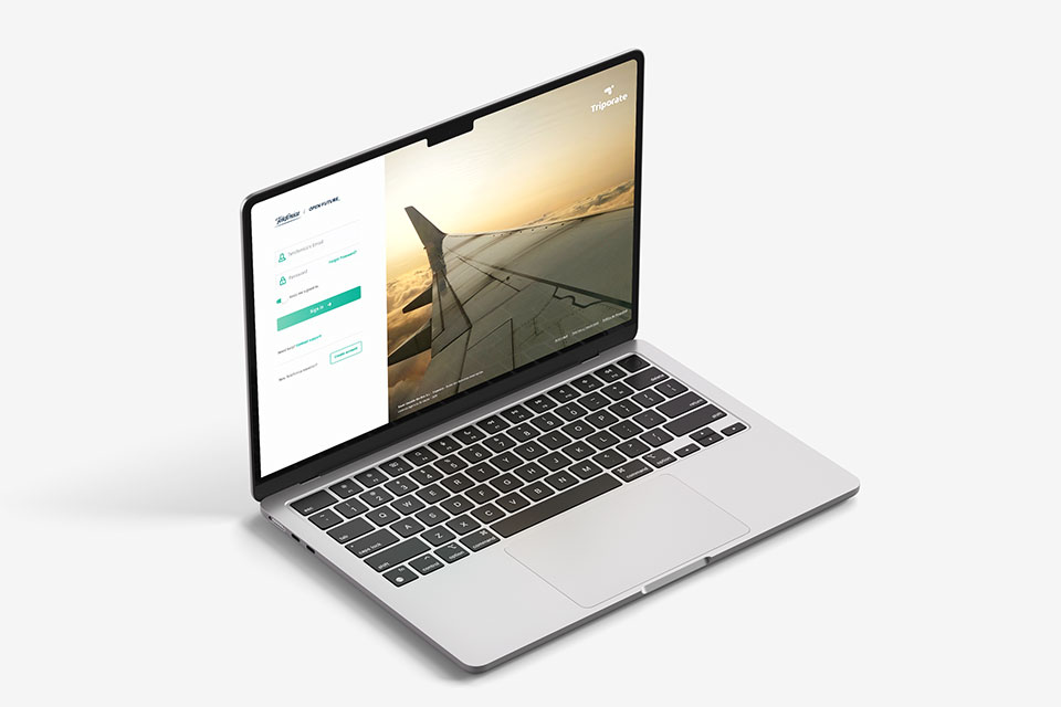
Image 5: Triporate SaaS sign up page.
Image 6: Triporate SaaS login page.
User Interface & Design System & Co-Branding
I structured all design assets within a modular Design System, including reusable UI components, icon library, color specs, and typographic scales, all documented in Sketch for transparency and future scalability.
Another major design decision was to enable co-branding flexibility, anticipating enterprise client’s needs to reflect their own corporate identity within the platform. I created a visual framework where both Triporate’s and the client’s logos, color accents, and headers could coexist without disrupting visual balance or usability. This made Triporate both scalable and enterprise-friendly, key factors for B2B adoption.
One more th¡ng...

Travel

Aeroplane

Train

Hotel
As part of this identity system, I also designed a series of abstract geometric shapes, inspired by the brand’s isotype. Each shape corresponded to one of the key booking services: airplane, train, and hotel.
These forms were conceived to serve as both functional icons and narrative symbols, helping users intuitively associate each stage of the booking process with a recognizable visual marker.
The proposal was very well received by the founders, as it not only strengthened the visual cohesion of the interface but also opened creative opportunities for motion design and onboarding animations.
5. Handover
Due to time constraints and a small team, the design system was intentionally lightweight but fully modular for future iterations. This system allowed the development team to rapidly iterate while maintaining design consistency.
Every asset was exported and paired with detailed annotations, ensuring a frictionless handover and long-term maintainability.
Handover package
- Exported assets and annotated specifications
- Copy and tone-of-voice guidelines for the interface text and actions
- Documentation on the design responsive behavior
The outcome
Product delivered!
The collaboration provided Triporate with a professional and coherent design foundation, aligning product, brand and investor readiness. Triporate evolved from a Demium Capital-incubated startup to joining the Google's Startups Campus Residency program in Madrid, a recognition of its scalability and innovation in digital travel management.
In August 2018, Triporate raised approximately €266,000 in a record-closing round in just one hour, from 36 investors via the Startupxplore platform.
In January 2020, the company secured a further €1.3 million in capital, backed by both existing and new investors including Aurorial, Bankinter, Reus Capital, Archipelago Next, Tokavi and the Travel Tech 1 fund of Top Seed Lab.
August 2018
From 36 investors via the Startupxplore platform.
January 2020
Backed by both existing and new investors.
These rounds highlight how Triporate succeeded in attracting investor confidence through its technology-driven vision, strong product traction, and clear market potential.
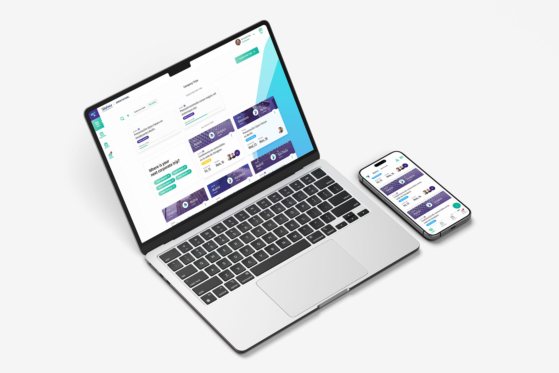
Image 7: Triporate SaaS home page.
Want to discuss my approach? Let’s connect.
Book a 1:1 with me. Book a slot that works for you.
Madrid, Spain
UTC +01:00
Monday to Friday
10:00 am - 1:00 pm
2:00 pm - 4:00 pm
7:00 pm - 8:30 pm