
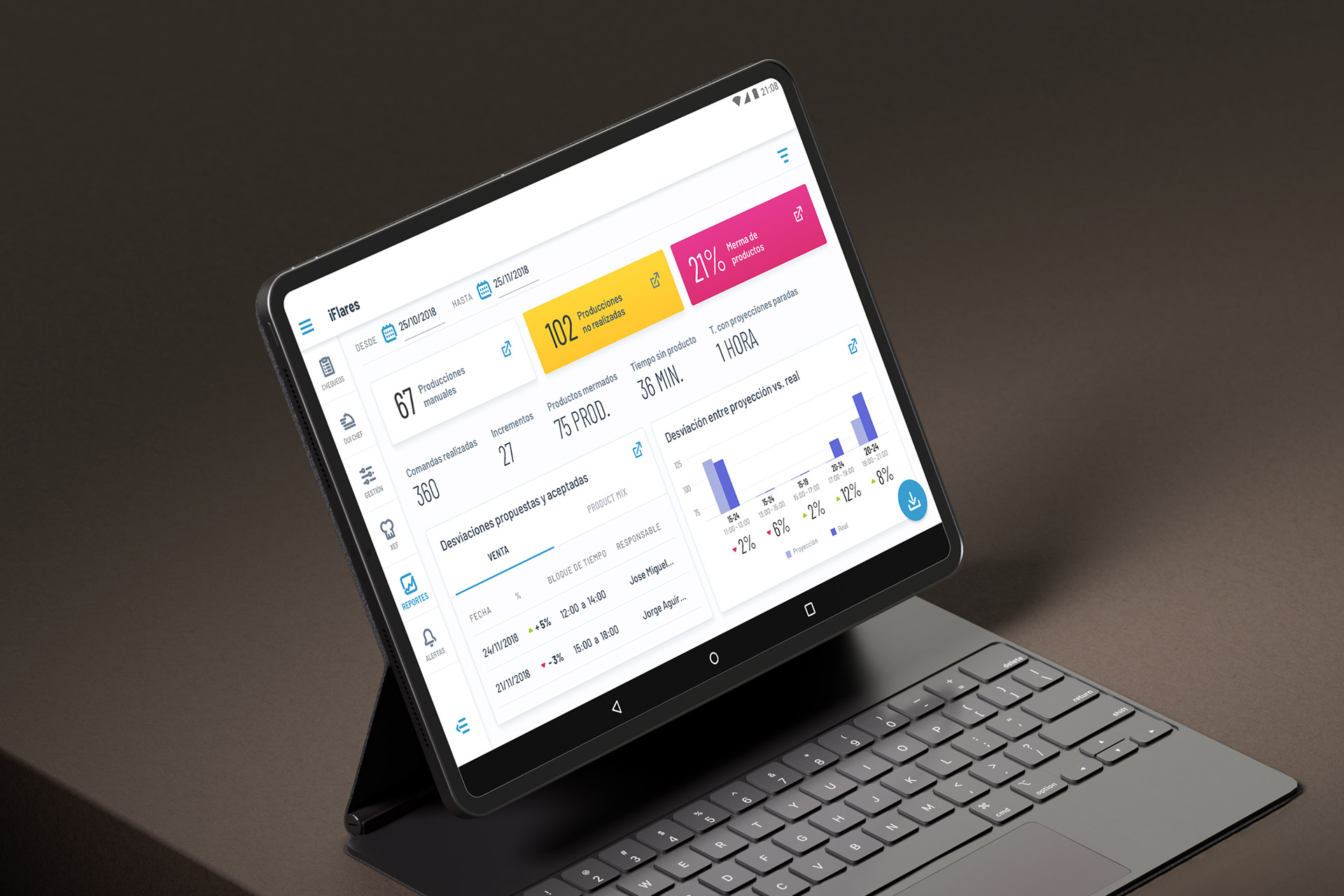
Photo: iFlares report section.
Project: iFlares native app
iFlares was a seed-stage startup developing a food management app designed to streamline and digitize all processes related to HACCP (Hazard Analysis and Critical Control Points) control.
The system simplifies daily HACCP operations by automating alerts, documentation, and compliance tasks. It allows businesses to analyze hazards, identify critical points, and ensure preventive measures are applied in real-time. Beyond being a tool, iFlares functions as a strategic ally for food businesses, offering full regulatory control, operational efficiency, and improved traceability.
The target audience included restaurants and food franchises seeking to modernize their compliance and food safety processes through a digital and scalable solution.
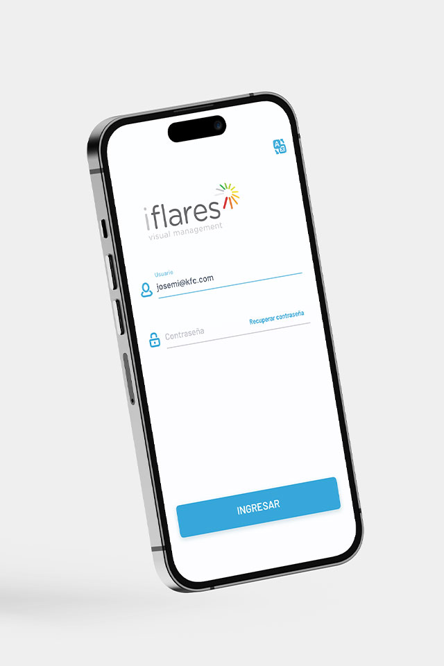
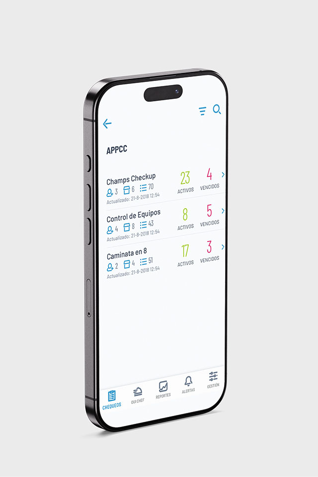
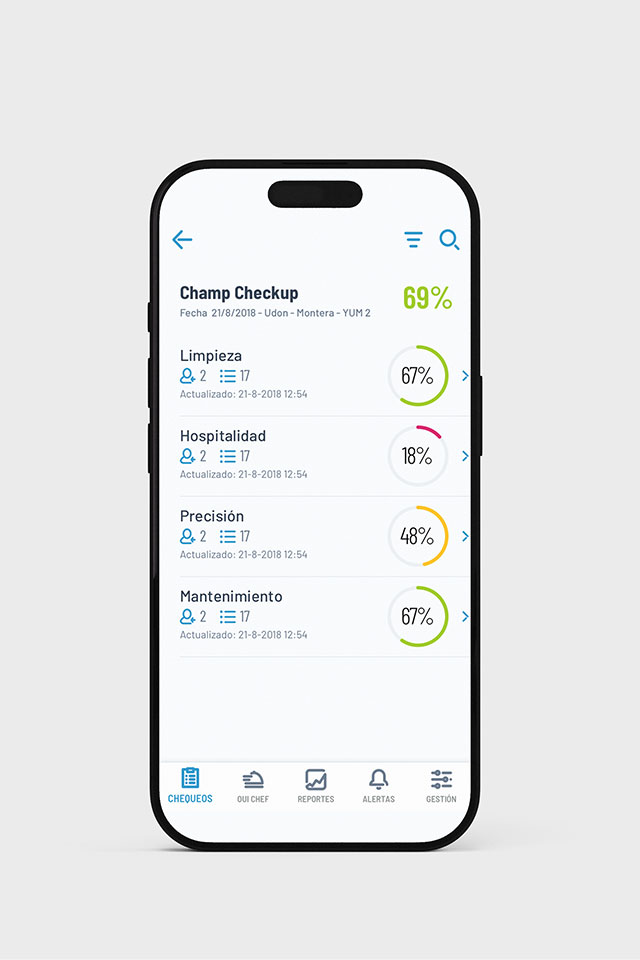
Image 1: iFlares login page.
Image 2: iFlares Checkups tab, APPCC level.
Image 3: iFlares Checkups tab, Champ Checkup level.
- Role: UX/UI Designer
- Client: Startup in seed stage, while participating in an incubator program
- Project type: Freelance project
- Platform: Android app
The problem
The opportunity
Traditional HACCP systems are largely manual, paper-based, and prone to delays or human error. This leads to three main problems:
- Inefficient manual processes that consume time and resources
- Inconsistent regulatory compliance due to the complexity and evolving nature of food safety laws
- Lack of real-time visibility, which delays hazard detection and increases operational risk
The main design challenge was to create a responsive multi-device experience adaptable to mobile, tablet, and desktop/TV resolutions, each serving distinct use cases. For instance: Kitchen dashboards needed to display order status and forecasts in real time; Staff interfaces required easy access to reporting tools, status updates, and equipment monitoring.
The solution had to remain intuitive, legible, and consistent across all environments.
The process
Even within tight constraints, strong design foundations can yield coherent, scalable, and high-value digital products.
1. Research
I began with an analysis of existing food management tools, identifying patterns and usability gaps in systems related to HACCP, compliance tracking, and kitchen workflow monitoring. The research aimed to understand the pain points of food businesses and how digital transformation could reduce administrative overhead.
2. Define
Together with the founders, we established the app’s main objectives, core roles, and interaction needs. The three user –Employee, Manager, and Admin– required distinct permissions, visibility, and actions.
This step was critical for designing the app’s information hierarchy and determining which features would appear per role and platform.
3. Ideation
During this phase, I created wireframes and flow maps to visualize task-based journeys and role-specific scenarios.
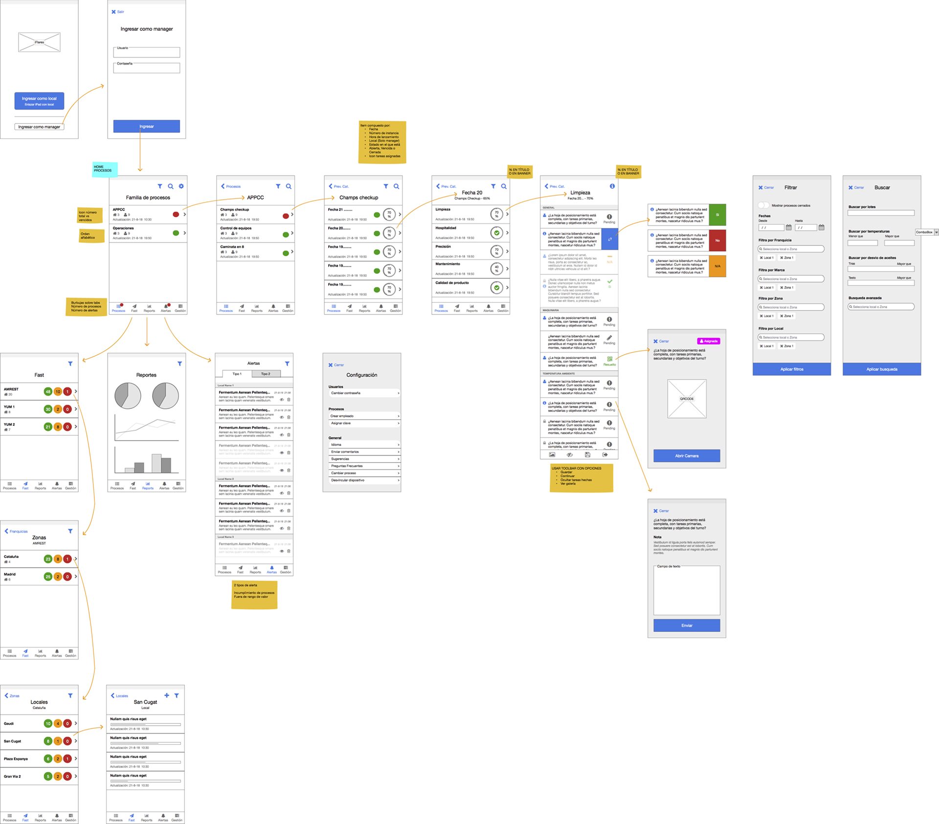
Image 4: iFlares wireframe, first-timer user flow.
I conducted ideation and validation sessions with the founders, aligning the business logic with user experience decisions. These sessions were essential to avoid misalignment, accelerate approvals, and build strong commitment from all stakeholders.
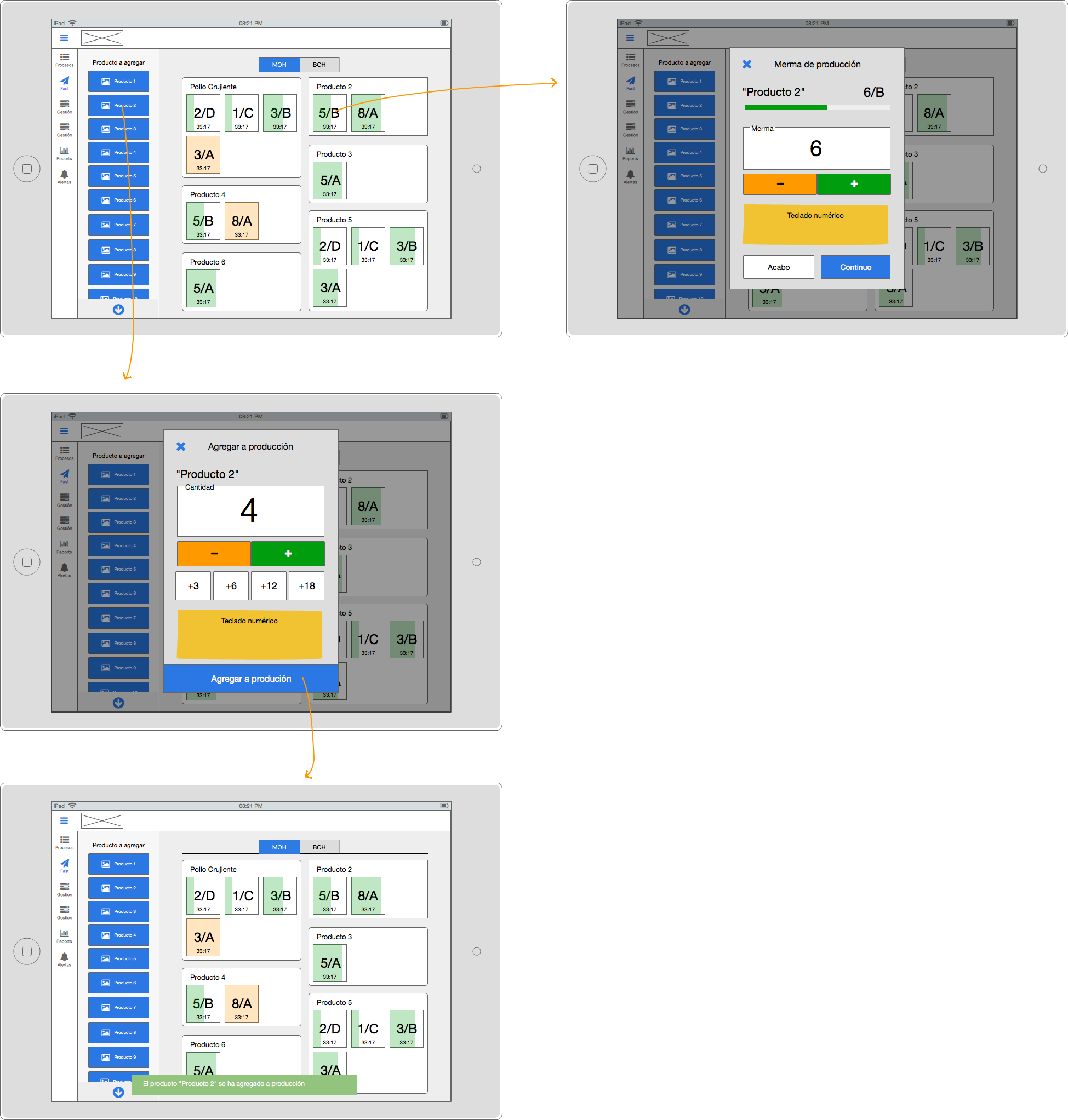
Image 5: iFlares Oui Chef tab wireframe.
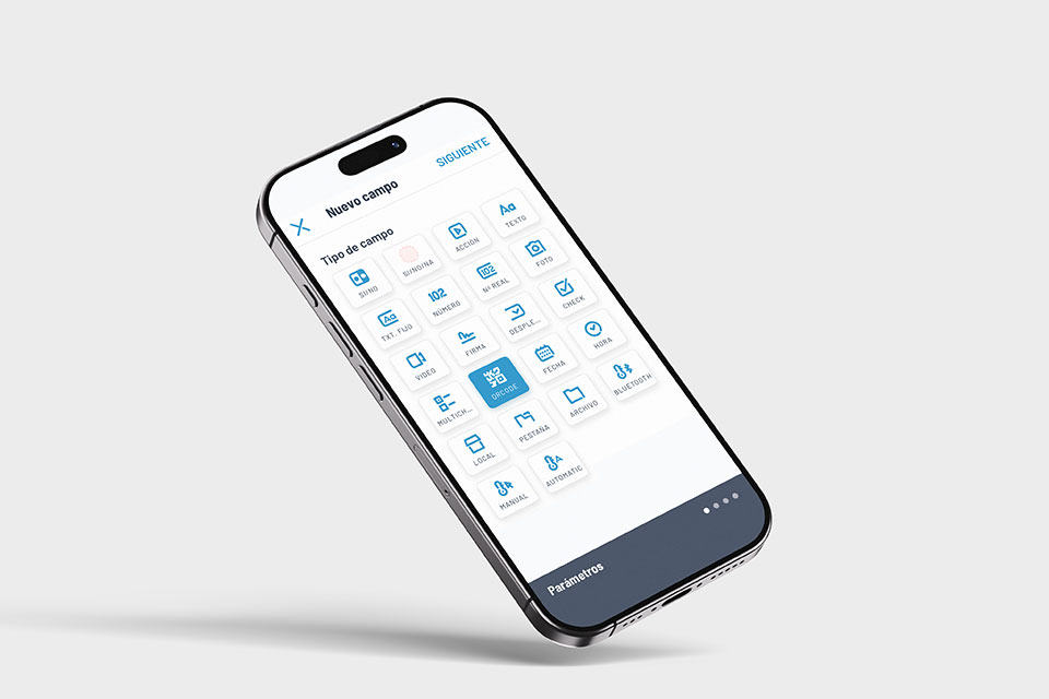
Image 6: iFlares Checkup creation, type of field.
4. Design
The app was designed following Google’s Material Design System, allowing for efficient collaboration with developers and rapid scalability.
I built a custom theme that applied a tailored color palette to support intuitive navigation and emphasize actionable elements.
Additionally, I designed a consistent iconography system that improved visual communication. Each icon serving as a contextual clue for quick recognition within complex workflows.
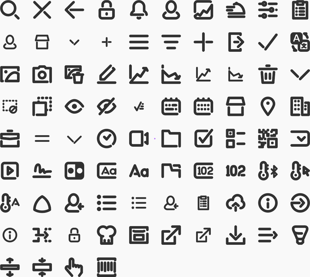
Image 7: iFlares iconography, custom designed icons.
5. Handover
The final delivery included all screen assets, interaction documentation, and style guidelines to ensure consistency in development.
Due to time constraints and a small team, the design system was intentionally lightweight but fully modular for future iterations.
Handover package
- Exported assets and annotated specifications
- Copy and tone-of-voice guidelines for the interface text and actions
- Documentation on the design responsive behavior
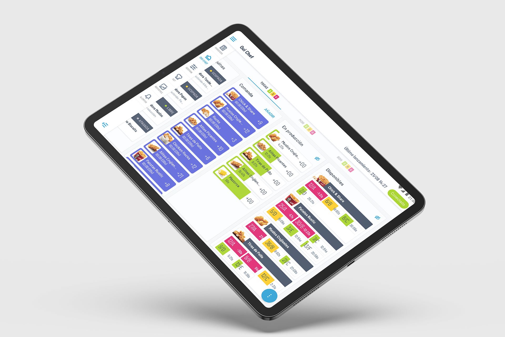
Image 8: iFlares Oui Chef tab.
The outcome
Product delivered!
I wasn’t part of the post-launch cycle, so I didn’t have access to metrics, adoption data, or qualitative feedback. However, during and after the collaboration, the project achieved strong alignment between design, business, and development goals.
All handoffs were smooth, and the design met stakeholder expectations both in usability and technical feasibility.
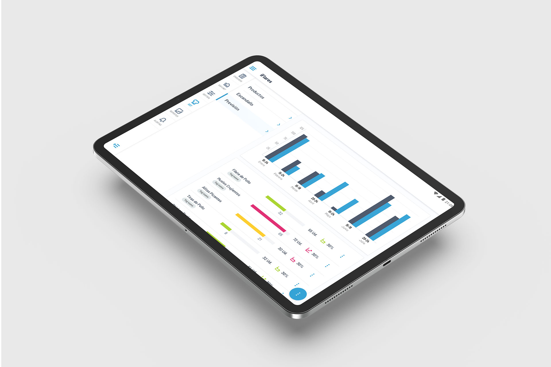
Image 9: iFlares Xef tab, foresight details.
Want to discuss my approach? Let’s connect.
Book a 1:1 with me. Book a slot that works for you.
Madrid, Spain
UTC +01:00
Monday to Friday
10:00 am - 1:00 pm
2:00 pm - 4:00 pm
7:00 pm - 8:30 pm